
Colors hold a mysterious power, don’t they? They can instantly set a mood, evoke emotions, and even influence decisions, especially when it comes to website design.
Imagine visiting a website that is all shades of dull gray—you might feel immediately uninterested or even leave! On the other hand, a well-balanced splash of vibrant colors can make you linger, explore, and engage.
Understanding color theory isn’t just for artists or graphic designers; it’s a crucial skill for anyone looking to design a website that captures attention and communicates effectively.
Think of colors as the unsung heroes that direct users’ eyes, highlight essential information, and create memorable experiences online. Dive into the world of hues, contrasts, and harmonies to unlock the secrets of creating visually appealing and highly functional web designs.
Ready to transform your website into a vibrant hub of creativity and impact? Let’s start by mastering color theory together!
Understanding the Basics of Color Theory
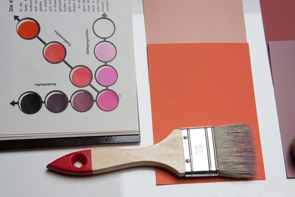
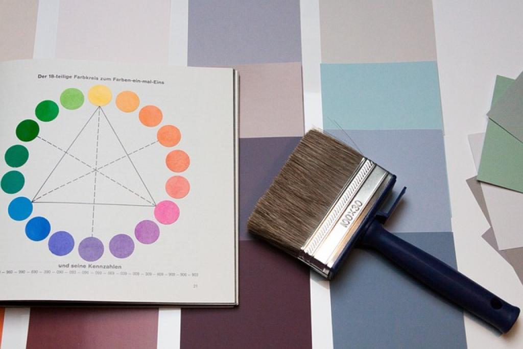
At the heart of effective website design lies color theory, a system that helps us understand how colors interact and the emotional responses they can evoke. It starts with the color wheel, a visual representation of colors arranged in a circle, showing the relationships between primary, secondary, and tertiary colors.
Primary and Secondary Colors
Let’s begin with the basics: primary colors—red, blue, and yellow—are the foundation. They mix to form secondary colors like green, orange, and purple. Pretty straightforward, right? But these colors aren’t just aimlessly thrown together; they each carry psychological meanings and associations that guide user perception.
The Importance of Color Harmony
Color harmony is all about creating an aesthetically pleasing and balanced look, which is crucial for any design, especially websites. It involves the strategic pairing of colors to create a sense of order and interest without overwhelming the audience.
Complementary colors, for example, are opposites on the color wheel and create dynamic, eye-catching contrasts. Analogous colors, sitting next to each other, offer a softer, more cohesive vibe. Both have their place in the design world, and knowing when to use each is key to mastering color theory.
By grasping these basics, you’re one step closer to creating visually stunning and emotionally engaging websites.
The Psychology of Color in Website Design
Have you ever clicked on a website and felt immediately at ease, or maybe unnerved? That’s color psychology at play. Colors can significantly influence our emotions and behaviors, consciously or unconsciously.
Different colors have different impacts. For instance, blue is often associated with trust and serenity. That’s why so many banks and tech companies use it in their branding. Meanwhile, red can evoke excitement, urgency, or even increase appetite—a reason why food brands love it.
Emotional Connections with Color
It’s fascinating how colors can connect on an emotional level. Yellow is often linked to happiness and optimism, while green tends to bring up thoughts of growth and tranquility. Understanding these emotional cues is essential for building a website that resonates with your audience.
Consider your brand’s message when choosing colors for your website. If you’re aiming for a calming presence, softer tones like pastel blues or creamy whites might work wonders. For a more vibrant, energetic feel, bold hues like orange or fuchsia could be your go-to.
Ultimately, the right color palette can create an intentional narrative for your website, guiding users’ moods and decisions. So next time you’re planning a website design, think about how you want your visitors to feel and let the colors lead the way.
Choosing the Right Color Palette for Your Website
Picking the right color palette for your website can feel like choosing an outfit for a first date—it’s exciting but can be a little nerve-wracking! But don’t worry, I’ve got some tips to help you nail it.
Understand Your Brand Identity
Start by thinking about your brand identity. Is it playful and fun or serious and professional? Your colors should align with your brand’s overall message and the emotions you want to evoke.
Now, look at your audience. Who are they? What do they like? Younger audiences might be drawn to bold and vibrant colors, while older audiences may prefer more muted, classic tones.
Once you have a sense of your identity and audience, consider using color theory tools. Websites like Adobe Color or Coolors can come in handy. They help you visualize complementary, analogous, or triadic color schemes.
Test and Iterate
Remember, it’s perfectly okay to experiment. Try a few different palettes and see how they look on your site. Gather feedback from friends or clients to refine your choices.
Most importantly, ensure that your color palette maintains good contrast for readability. Accessibility is key, as you want all visitors to have a great experience on your website.
Choosing a color palette is a creative journey. Have fun with it, and let your colors tell your story!
Implementing Color Contrast and Accessibility Guidelines
Creating a website with great color contrast isn’t just about aesthetics; it’s about making sure everyone can enjoy your content. Accessibility is a crucial part of web design because it ensures that everyone, regardless of ability, can engage with your site.
Understanding Color Contrast
Let’s break it down: color contrast refers to the difference in light between font (or anything else in the foreground) and its background. Good contrast makes text readable and eye-catching, even for those with visual impairments.
A common guideline is to maintain a contrast ratio of at least 4.5:1 for normal text and 3:1 for large text. These recommendations ensure that your content is legible to most people.
Use tools like the WebAIM Contrast Checker to evaluate your color choices. Simply input your foreground and background colors, and it’ll tell you if you meet the necessary standards.
Practical Steps for Accessibility
As you dive into designing, integrate accessibility from the get-go. Choose colors that go beyond aesthetics, ensuring functionality and usability for everyone.
When designing, limit your colors for text and important elements, sticking to combinations that meet contrast standards. Think outside of just text too—icons, buttons, and links need attention for accessible color contrast as well.
By prioritizing color contrast and accessibility, you’re not only improving your website but also showing that you care about all your users. That’s a win for everyone!
The Impact of Color on User Experience and Conversion Rates
Colors aren’t just about making your website look pretty; they’re a powerful tool for shaping how users interact with your content. The right colors can guide users, evoke emotions, and even influence decisions.
Let’s talk user experience. The color palette you choose sets the tone for your entire site. Calming blues can make a site feel trustworthy, while bright yellows might be just what you need to inject some energy. The key is to match colors with the vibe and message you want to send.
Now, onto conversion rates. Believe it or not, color can directly impact whether or not users take action on your site. The color of a call-to-action button, for instance, plays a significant role in catching eyes and inviting clicks. Red might scream urgency, whereas green often signals a positive action or approval.
A/B testing different color schemes can help you pinpoint what resonates best with your audience. This testing ensures you’re not just guessing but making decisions grounded in results.
Bottom line: carefully choosing colors can lead to happier users and, quite possibly, better business outcomes. Consider your audience, test your choices, and see how color can make a difference.
Conclusion: Harnessing the Power of Color Theory in Web Design
We’ve journeyed through the vibrant world of color and its undeniable influence on web design. It’s clear that color isn’t just a decorative element; it’s a cornerstone of user engagement and conversion.
Understanding color theory allows designers to make intentional choices that resonate with users. Whether it’s evoking specific emotions, highlighting essential elements, or guiding decisions, color has the potential to elevate a website from good to great.
Incorporating the right colors can enhance the feel and functionality of a site. It’s about finding harmony with your brand’s identity and the message you want to communicate. The right mix can captivate attention and lead visitors smoothly through your content, boosting interactivity and connection.
In light of this, by leveraging tools and strategies like A/B testing, you can tailor your color schemes to what truly clicks with your audience. Testing different hues and contrasts can help you discover what works best for improving user experience and achieving your goals.
In essence, color theory is more than art; it’s science combined with creativity. By harnessing this power, you can create compelling web designs that are not only visually appealing but also highly effective.
So, as you embark on your next web design project, remember the insights on color theory. Use them to craft engaging digital experiences that not only attract but also retain your audience. Keep experimenting, stay curious, and continue harnessing the full potential of color!